CAGW in proportion
Richard Law, UTC 2017-02-02 08:32
In September 2015, the very first month of this blog's existence, our quote of the month came from the great mathematician and philosopher Blaise Pascal's (1623-1662) Pensées:
Limited as we are in every faculty, our powers are to be found in the mean between two extremes. Our senses cannot perceive extremes: too much sound deafens us; too much light dazzles us; too great a distance or too close a proximity obstructs our view. Both too great a length or too great a brevity of discourse obscures meaning; too much truth shocks.
Pascal's insight into the human proportions of perception – let's call them the 'perceptual field' – is currently very relevant to the CAGW panic. Our human perceptual field is not 'climate' but 'weather', that is, the weather over hours, days and weeks that regulates what we wear, whether we take an umbrella with us or apply suncream. Beyond that, we start to get a bit vague: 'our senses cannot perceive extremes' as Pascal put it.
We usually remember past weather as it related to certain events – a rained-off barbecue, for example – but only those who are professionally or intimately concerned with weather such as meteorologists, gardeners or farmers can really relate to statements about periods, such as 'January was very dry', or, even worse, 'was drier than usual'. Can any normal person truly understand or relate to a statement of the type: '2015 was a warm/cold/wet/dry year', let alone compare that year to 2014 or 1947? Our only honest response is: 'If you say so'.
The alarmist noise around the recent 'warmest year ever' meme is intended to bring the fear of CAGW into the perceptual field of the common people, even though even alarmists accept that 'climate' implies a period greater than 30 years. The weasel word, of course, is 'ever', which really means 'the date which we pick as the start of the comparison'.
This meme is relatively new. There was a time a few years ago when we used to hear a lot about 'trends' and be shown the warming projections of mathematical models. Recent temperature trends when honestly computed and fairly represented, certainly in the accurate satellite record, are slight or flat. They have lost their capacity to frighten.
The projections of computer models – all of them – have been shown to be more or less wildly wrong, so we hear little about them directly these days. They are, however, still being accepted unquestionably as the basis for guessing the impacts of CAGW on something or other, be it alpine plants, garden snails, sea levels or whatever the current object of panic is.
In September 2015, in the spirit of Pascal's remark, we stepped back and looked at the size and grandeur of the famous 'Pillars of Creation' image from the Hubble telescope that shows us cosmological structures that exceed all human capacity for true comprehension: we look at the image and we read that the pillars are 'about 5 light-years tall', we nod sagely and move on – what else can we do? Remember, too, that this image is itself one tiny speck in a structure so vast that… words simply fail us. When 'Man is the measure of all things', what adjectives can we apply to such immensities?
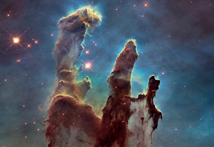
'Too great a distance or too close a proximity obstructs our view'. The 'Pillars of Creation' a famous Hubble image of the Eagle Nebula.
Thus, instead of worrying about a hundredth of a degree difference between one year and the next in a century of gentle warming, let's look at a view of the Earth's climate that might be taken to correspond to the 'Pillars of Creation' view of the Universe. It actually looks somewhat like them. too.
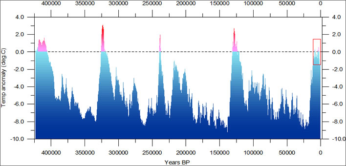
Reconstructed global temperature over the past 420,000 years based on the Vostok ice core. Image: Climate4you [Ole Humlum, Professor of Physical Geography at the Department of Geosciences, University of Oslo.]
This is a graph of temperature anomalies covering about the last half-million years computed from characteristics of the Vostok ice core from the Antarctic. A temperature anomaly is a number that represents the difference between a reference temperature and a temperature at a particular point in time. The x-axis runs left to right from past to present.
In the CAGW debate we should always be suspicious of anomalies since they can be used to generate graphs showing at first sight dramatic changes, but when you look at the scales of the graph the horrifying 45° slope of temperature (upwards) or sea-ice (downwards) usually turns out to be really just a tiny absolute change. However, the anomalies shown in the present graph are relatively harmless. Their reference temperature is the modern temperature, shown in the dotted red line.
The title of this graph would traditionally be something like 'The last four ice-ages'. Such a title would be correct, but completely misleading, because, when you look at the graph, the first thing you notice is that the four ice-ages are really the normal state in that period of half-a-million years. We should really talk about 'warm spikes', not ice-ages, because they are in fact merely brief interruptions in this cold world. Just because we are currently in one of those warm periods we should not assume that this is 'how it is'. It isn't. Our current gentle climate is quite abnormal. The question should not be 'what caused the ice ages?', but 'what caused the warm spikes?'.
The title should therefore really be 'The last five warm spikes'. These warm periods can indeed be called 'spikes': they last between 10-15,000 years, whereas the cold periods are all about ten times as long, that is, about 100,000 years. Their duration seems to have increased, too, through time, but let's not make too much of this in the present context.
An examination of the theories claiming to explain these rhythmical variations in temperature is beyond our scope and ability. We only need to realise that in this last half-a-million years, life on the Earth has balanced precariously at the top of these five peaks. On the top of the temperature peaks living things flourished, in the temperature valleys living things survived – just.
We should note that the conditions in these periods are cumulative, not static. By the end of the last ice-age, for example, huge areas of the northern hemisphere were permanently under ice up to a mile [2.6 km] deep. Take a moment to consider that reality. There was no life on that ice sheet at all. Animal life forms depend ultimately on the existence of plants at the bottom of the food chain: there are no plants in those conditions and so there could be no life. There was certainly life on the margins of the ice sheets as they extended and retreated over the millennia, but even where the snow was not permanent we cannot say that life flourished.
The current peak on which we find ourselves has now lasted about 11,600 years, so we are now in a zone where a relatively sudden return to normal temperatures – that is, an ice-age – might be expected. Yes, we might have a few thousand years yet, or it may be just around the corner. The trailing edges of the spikes are very steep: once we realised what was coming we might have a few centuries to find some way of preserving our pleasant biosphere for the next 100,000 years or so.
In such a case, when the climate scythe is taken to the plant and the animal world, our current fussing about protecting the 'diversity' of life forms on earth will seem to have been a strange and self-indulgent affectation.
Let's look more closely at the temperature spike upon the pleasant top of which we are currently living, the 'Holocene' (red rectangle). We notice that, compared to its predecessors, the spike is broad and has never attained anything like their temperature peaks.
The temperature details of that period are shown in the following graph. We have moved from Antarctica to Greenland for our data source. Now we can see the ragged top of the spike in some detail. Once again, the x-axis runs from past to present and once again we are looking at anomalies. The anomalies have now become trickier to interpret: we look carefully at the righthand y axis and note that the entire variation takes place within a scope of about two degrees and on the left we see that the absolute temperatures above the surface of the Greenland ice sheet, shown on the lefthand y-axis, range between -34° and -29°.
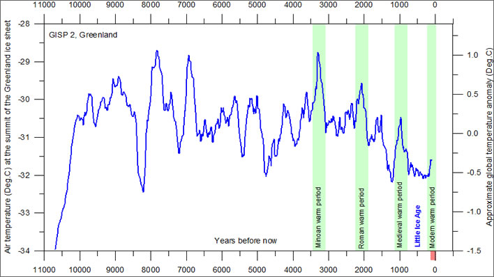
Air temperature at the summit of the Greenland ice sheet. Image: Climate4you.
Onwards – but with caution. The period from about 10,000 to about 4,000 years is of only academic interest because we have no historical records from this period. Archaeologists might find the temperature peaks at 9, 8 and 7 thousand years BP (Before Present) as well as the marked plunge just before 8,000 BP interesting, but our attention is drawn to historical times.
The pale-green bars mark four obvious temperature peaks. We notice without needing to squint that the maximum temperatures of these peaks decline. The 'Minoan Warm Period' was warmer than the 'Roman Warm Period', the latter in turn was warmer than the 'Medieval Warm Period'. This graph ends around 1854, at which point it entered a phase here named as the 'Modern Warm Period'. We notice, too, that these high temperature moments really were peaks: the low temperatures in between them are much broader valleys. Furthermore, just as the temperatures of the peaks reduce as time goes by, so do those of the floors of the valleys. For about the last 3,000 years there has been an easily noticeable cooling trend.
We are not surprised to note that these peaks correspond to historical and cultural high points in European history. Even the marked temperature drop between the Minoan and the Roman Warm Periods can scarcely be called an 'ice-age', whereas the temperature drop after the Medieval Warm Period, starting from a much lower point, definitely can. It was given the name 'Little Ice Age'. It corresponds to a tumultuous and dark time in European history. Temperatures have been rising ever since the end of the Little Ice Age, but have still not quite reached the level of the peak of the Medieval Warm Period.
If we now step into the Modern Warm Period we can see its detail in the following graph.
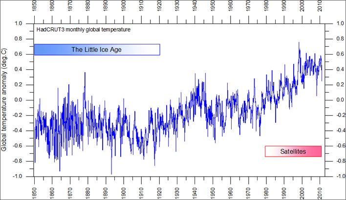
Global monthly average surface air temperature since 1850 according to Hadley CRUT. The label 'Little Ice Age' seems to be misplaced, but this does not invalidate the curve. Image: Climate4you.
Once again we are looking at anomalies, hence once more the warning that this detailed plot really only represents a total range of 1.8°C. It is generally held that the effects of carbon dioxide on global average temperatures can only be noticeable after about 1950. Let us leave unexamined what a 'global average temperature anomaly' is and what magic can apparently compute it to hundredths of a degree. We also leave aside the many problems there are with surface thermometry and the adjustments required to bring this onto paper, as we also do with any comparison with the much shorter but more trustworthy satellite record.
Back to Pascal. We lift our eyes from our microscope and return to our telescope to note the tiny, barely visible temperature squiggle of the last century that has generated so much speculation about imminent disaster and the end of mankind.
We look once again at the five brief spikes of warmth among half-a-million years of dark cold and think: what was all that about, that 'warmest year ever', let alone the '100 days left to save the planet'? Throughout its time on earth, life has had to adapt to climate: to temperatures, precipitation and sea-levels. No plot of atmospheric carbon dioxide leads us to think it has anything but the most trivial influence on these gigantic fluctuations. Why do we consider the climate of 1950 so perfect that we should vainly try to preserve it at a cost of trillions of dollars?

0 Comments
Server date and time:
Browser date and time:
Input rules for comments: No HTML, no images. Comments can be nested to a depth of eight. Surround a long quotation with curly braces: {blockquote}. Well-formed URLs will be rendered as links automatically. Do not click on links unless you are confident that they are safe. You have been warned!