![]()
Abnormal normals
Richard Law, UTC 2017-11-26 13:33
Two questions you have long wanted to ask: a) What is a 'climate normal' and b) why do I need to know about it?
Well the answer to b) is simple: if you want to be a Renaissance (wo)man these days, this is the kind of stuff you simply have to know. You will also be able to hold your fellow dinner guests spellbound with your learning. You will never be invited again, so choose the gathering wisely.
The answer to a) is best given through learning-by-doing: we shall go together through the steps of calculating a climate normal. For this you will need, but only symbolically: a max-min thermometer (we shall assume a Celsius/Centigrade scale), a pencil, the back of a large envelope and some residual skills in primary school maths. Oh, and you have thirty years to complete this task, so no stress is involved.
Normals made easy
Set up your thermometer in a shady place outdoors. CAGW professionals usually pick a location next to an outlet with a warm airflow – positions next to the outlets of air conditioners or cooker hoods, or above a barbecue grill have proved their worth.
At the same time once every day – traditionally 09:00 – read and record the maximum and minimum temperature from the thermometer.
Maths alert! Add the two values together and divide by two, which will give you the average temperature for that day. Write this down. If you want to show off your maths skills you can keep any decimals that turn up. This shows that you have the makings of a climate scientist: although you probably just read off the thermometer in full degrees, the extra decimal places will add lustre to your results.
The worriers among you will be wondering what possible meaning this figure for average temperature can have. Well, apart from being a temperature that was achieved briefly on two occasions that day, it has no meaning at all. The World Meteorological Organization (WMO), who set the standards for calculating climate normals, puts it like this:
Even though this method is not the best statistical approximation, its consistent use satisfies the comparative purpose of normals.
WMO 4.8.5
Translation: the average temperature value is meaningless, but as long as everyone uses it, it is at least uniform meaninglessness. The phrase 'not the best statistical approximation' is a very gentle way of expressing that an average is meaningless, but the author's strange phrase 'statistical approximation', implying that an average is some sort of 'approximation' suggests a general lack of statistical insight.
So keep collecting the daily averages for a full calendar month. Maths alert! When a month is finished add up the daily averages and divide by the number of days to give an average temperature for the month. Yes, I know, months have different numbers of days, but just do it. [WMO 4.8.4]
Dividing totals by 31, 30 or 28/29 will give you a welcome opportunity to use many more decimal places – only amateurs round these up or down. By the way – if during all this arithmetic effort you find yourself chewing your pencil and wondering about the ontological status of calendar months in the progress of the seasons – that is, for example, why the period 1-31 March 'exists' rather than the period 15 March-15 April, or any other period for that matter – you are clearly not cut out for this kind of work.
We have now taken our meaningless day averages and averaged them to even more meaningless month averages. We still haven't reached peak meaninglessness, though. But we can now take one more step towards this transcendental state.
Maths alert! When you have obtained your monthly averages for the twelve months of the calendar year, add them up, divide by twelve and bingo! you have an average temperature for the year. Now write '°C' after this number.
The worriers among you will be even more worried by now, brows furrowed and faces contorted. 'What on Earth has this number got to do with anything?', they gasp. Spoilsports.
For example, you can turn to the charming person sitting next to you at dinner and whisper: 'Last year the air in front of the brick next to the outlet of the cooker hood in my garden had an average temperature of 3.14159°C'. 'Pi?' 'Sometimes, but usually spaghetti bolognese'.
We still haven't quite achieved peak meaninglessness, though, but meteorologists are an inventive bunch and can bring us a little way further. All you have to do now is repeat this annual procedure every year for 30 years. More accurately: for one of the 30 year periods defined by the WMO. Why 30 years? Because at the time the WMO dreamed up this procedure at the beginning of the 20th century, they had just 30 years of historical data available: 1901-1930, 1931-1960, 1961-1990, 1991-2020. [WMO 4.8]
The thirty yearly values are averaged, but the WMO recommends the use of statistical smoothing for doing this. The object of statistical smoothing, which uses maths you didn't learn in primary school, is to add some semblance of reality to these meaningless numbers. Not real reality, of course, just a semblance of it. The object is to get a number, e.g. 4.62, which in some mystical way 'represents' this 30-year period.
This number, please note, is essentially the average of the averages [years] of the averages [months] of the averages [days]. We can then stick '°C' on the end of it to turn it into a 'temperature'.
There are purists who worry at the validity of the concept of a single average (arithmetical mean, to be precise), let alone a concatenation of four. There are even more sensitive souls who fret whether an average can really be assigned the dimensions of its elements: it's not really a physical value, surely, just a dimensionless number. Never mind: climate science is not a field for the thoughtful or the sensitive, let alone the pedantic. Be happy – we are now only one step away from peak meaninglessness.
Peak meaninglessness among the peaks and valleys
The interest of the world in the temperature of the air around the thermometer in your garden over that thirty year normal period will not be great. What real meteorologists do is to take the values from all the thermometers in their country and process them all together.
In Switzerland, for example, these measuring stations will be in towns, by lakes, on tops of mountains, at airports and military bases – you get the picture. All this data goes through our mincer – all these averages of averages of averages so that we come up with a number for the whole of Switzerland in that year – from the heights of Mont Blanc, Säntis and the Jungfraujoch to the lowlands of the Rhine at Basel. Let's say we get the number 4.3. This, the worriers will confirm, is a number of such meaninglessness that it takes on a transcendental glow. We just need to write '°C' after it and our bliss is complete.
Swiss normals
Well, computing all this meaninglessness keeps meteorologists harmlessly busy, but today comes an example from the Swiss Meteorological Agency of the normals for Switzerland being used to back up an argument about the accelerating pace of climate change in Switzerland.
It only requires a moment's thought to realise what bad practice this is. These numbers come from measuring stations whose quantity, location and precision vary over time. Just stacking up blunt averages for a short period might be interesting in a meaningless sort of way, but comparisons between the various normal periods are utterly misleading. Even the WMO says that you shouldn't make comparisons between the individual normal periods.
We only have to look at the graph of normals provided by the Swiss Meteorological Agency for the whole of Switzerland to see how bizarre this data can be.
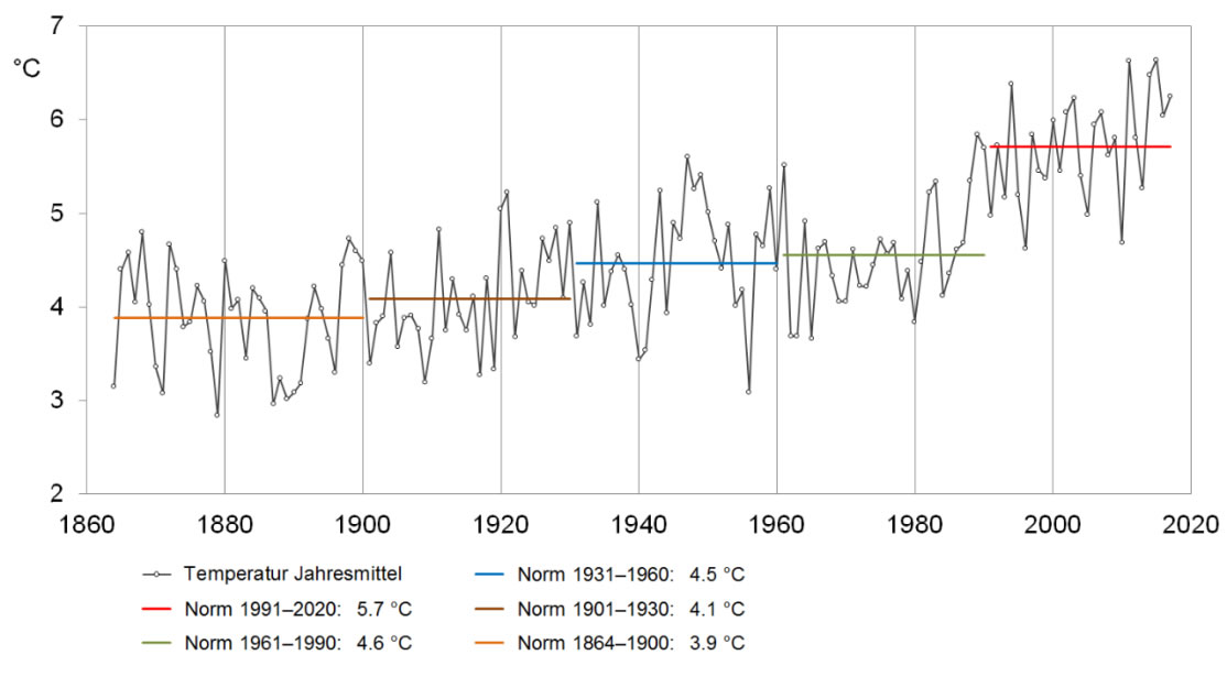
'Countrywide averaged yearly temperatures from 1864 to 2017 with the 30-year standard normals from 1901 and the early industrial period 1864-1900'. Image: MeteoSchweiz. [Click to open a larger image in a separate browser tab.]
The pronounced 1.1°C jump between the normals of 1961-1990 (4.6°C) to 1991-2020 (5.7°C) is, according to Mr Climate, a sign that CAGW has really taken hold in Switzerland. Its propaganda effect is powerful: any layperson glancing at this graph would come away with the idea that Switzerland was about to get it in the neck from global warming. As one commmenter noted: 'you just have to stand back a little from this graph to see how real and dangerous global warming is'. Which is, I suggest, the reason for its use in that article.
We shouldn't stand back, we should instead look at it much more closely and ask ourselves what natural phenomenon in Switzerland increased the average temperature in the country in the four years from 1984 to 1988 by 1.8°C (5.8 - 4). The answer: there wasn't one – at least not one that I can think of. Failing a validated sighting of the four horsemen of the apocalypse, this step change has to be an artefact of measurement, methodology or computation – or all three.
We also have to remember that the data used to calculate normals is subject to the same homogenisation procedures that are such a contentious subject in the derivation of temperature anomalies. The seemingly static normals are being recalculated all the time as the underlying measurements are 'refined'. No one is surprised any longer that this refining consists, almost without exception, of cooling the past whilst warming recent years.
Just looking around other parts of the graph we are at a loss to account for the marked cold plunge that took place in the first half of the 1950s or the warm spike that took place in the second half of the 1950s. The hot spike in 1947 is equally mysterious: it brought the annual average temperature up to the average values for the modern period.
In the first period (1860-1900) we see large erratic fluctuations at a slow frequency. The next period, 1901-1930, is less erratic but the frequency of the fluctuations is much higher.
Then we have this strange period 1931-1960, which, beginning much like its predecessor, from 1937 onwards goes numerically berserk, with large, low frequency swings.
The period 1961-1990 restores order, so to speak, with low amplitude, medium frequency fluctuations, but ends with the remarkable step change of nearly 2°C. From 1991, after the step, we return to a period of relatively low amplitude, relatively high frequency swings.
The Federal Office of Meteorology and Climatology in Switzerland also produces a graph of annual mean temperatures using a more sophisticated smoothing algorithm. The annual mean temperatures and the overall temperature rise between 1864 and 2015 is the same as the WMO chart – no surprise since the underlying data is the same – but the shock effect is much less:

Annual mean temperature in Switzerland from 1864 to 2015. Shown are the mean values of the individual years (black) and the smoothed curve (red). Image: MeteoSchweiz. [Click to open a larger image in a separate browser tab.]
There is a lot of high level skulduggery applied to the preparation of the data which produces the Swiss annual means – a pencil and envelope are not enough. There is much selection, smoothing, weighting, pushing and shoving involved in getting these numbers. The basis of all the weighting done was a 20 year part of the 1981 to 2014 period, which may explain the sudden, incongruous lurch to high temperatures in the mid-eighties. There is also gridded data in there somewhere which does something or other. This fills me with even less confidence than the back of an envelope method, but MeteoSchweiz have to their credit produced and published an excellent downloadable summary in English and German of their procedures.
In what now follows we could just as well have used the annual average temperatures from this graph, but the WMO normals graph is the one Mr Climate showed us and so we have stuck with that. Our criticisms of the use of mean temperatures still holds, no matter how elegantly and thoroughly they have been statistically pummelled into shape. A single number to represent the mean temperature of a year and a whole country is nonsense.
Switzerland versus the planet
It is a frequent argument used to frighten the Swiss Government and the gullible ones in the population, that Switzerland is climatologically a special case, uniquely vulnerable to global warming. Well, maybe it is, maybe it isn't – that's a discussion for another time – but we would expect the temperature pattern in Switzerland to bear some sort of relationship to global temperatures, particularly if the period graph is to be taken as an indicator of AGW in the country.
To examine this we can turn first to the UAH satellite temperatures for the period 1979-2017. Despite a continued effort by its opponents to subvert it, this series remains the gold standard for near surface and tropospheric measurements over the satellite period (now nearly 40 years). Its results are validated by independent measurements such as balloon radiosondes and – unlike the extremely patchy coverage offered by ground stations – it offers an almost complete coverage of the earth's surface.
We just have to be careful in making direct comparisons, because these are anomaly values that represent changes from one measurement period to another. For this reason we shall not compare temperature values but simply temperature patterns.

UAH Lower Atmosphere Temperature Anomalies, 1979 to present. University of Alabama at Huntsville (UAH), Dr. Roy Spencer. Base Period 1981-2010. Image: Dr Roy Spencer, UAH. [Click to open a larger image in a separate browser tab.]
Starting at the left of the graph, the 18-year period from 1979 to 1997 is a 'cool muddle': low amplitude, high frequency variations with an effectively flat trend. The two years, 1997-1998, were the period of a strong El Niño in the Pacific. In 2003 and 2006 we see the traces of the 'great' European heatwaves of those years. All three of them were useful propaganda moments for the CAGW enthusiasts.
After the 1997-1998 El Niño the global temperature trend, despite the European heatwaves, remained flat for the next fifteen years or so. Global temperatures did what they had done in those first eighteen years of the measurement period: once again fluttering around a flat trend with low amplitude, high frequency swings. The flat trend from this period was the basis of the so-called 'pause'. Another El Niño came along in 2014-2016 and pushed global temperature up just as the previous one did, much to the delight of the anti-pause brigade.
Surely that 'climate exception' Switzerland, could not have been immune from the great global movements. Lets have a look at the same period in the normals chart:
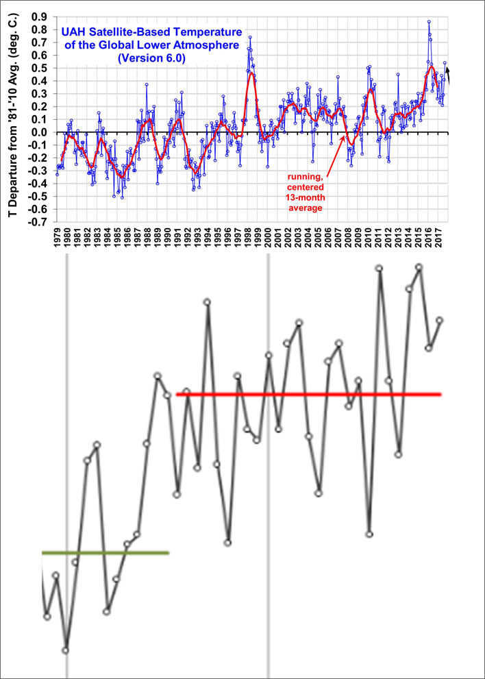
Top: UAH Lower Atmosphere Temperature Anomalies, 1979 to present; Bottom: MeteoSchweiz, 30-year standard normals, 1979-2017, timescale aligned.
Going from left to right we notice first that whilst the world as a whole was experiencing that 'cool muddle' in the first eighteen years of the period, Switzerland underwent a period of rapid warming, according to the annual averages. If we do our best to disregard that powerful red line, we note that by 1996 the yearly average had fallen to where it was in 1986.
In the satellite record in the years immediately following 1991 we notice a marked downturn in global temperatures. At least part of this cooling is commonly ascribed to the effects of the catastrophic eruption of Mt Pinatubo in the Philippines in June 1991. In the Swiss yearly averages there is indeed a small downturn in 1992, but 1991 itself is actually a temperature peak. The biggest drop in annual temperatures around this time comes in 1994-1995, three years after the eruption and when everyone else in the world is enjoying a small temperature recovery.
More generally, it troubles us that the peaks of the yearly averages in Switzerland during this period all occur in times of troughs in the world temperature anomalies. In other words, there is an inverse correlation between the two. If you stand far enough back you will get the impression that both graphs are (sort of) tracking each other. In fact numerically they are not: they are frequently going in opposite directions.
Coping with El Niño
There are two annual peaks in 1982 and 1983 in the Swiss record that seem to reflect the large El Niño of those years. But more striking is the fact that in Switzerland there is no trace of the 1997-1998 El Niño – if anything we find an inverse correlation. There are relatively high – but not dramatically so – values for the 2003 and 2006 European heatwaves.
I was living in Alsace in 2003, close to the French border with Switzerland, and that summer was indeed hot. The media scandale du jour in France was that many young families had departed for their sacrosanct August holiday leaving their elderly relatives to bake and suffocate in their tiny attic flats. Switzerland experienced only a mild form of this dramatic heat, according to the annual averages.
In contrast, the heatwave of 2010 that affected most of the northern hemisphere, clearly visible in the satellite record, appears in the Swiss normals as a remarkable temperature plunge, followed by an equally remarkable high temperature in 2011, when the rest of the world had cooled. The 2014-2016 El Niño, though, seems to find its correspondence in the twin peaks in the Swiss record.
In the 'pause' period the annual averages swing around in a nondescript way – if you squint hard you may be able to make out some sort of correlation with global temperature, but if you can it is a triumph of desire over eyesight. Even the dramatic swings in the normals of 2008-2011 are not really tightly correlated with the global anomalies.
If we take the WMO normals seriously and compare them with the global satellite record we can state that the Swiss are not just a special climate case, they live on another planet.
A look at the neighbours
What about normals in neighbouring countries – how do they compare with the Swiss normals?
It has to be said that many other European countries don't seem to be too keen on making a big deal of the lumbering antiquity that is the WMO system. Let's take Austria, who publish – very discreetly – the numerical data for the WMO system. They do this in the interests of openness they tell us, but if you want graphs you can damn well do them yourself. That's a sign of their own lack of faith in the product.
They also do not publish consolidated data covering Austria as a whole, just data for the federal states, so if you want values for the whole of Austria you are on your own. We may consider that their reluctance to publish the final step towards meaninglessness comes out of embarrassment at this nonsense. We probably should applaud them.
I did however, after much digging, find the WMO normals graph for Klagenfurt, a city close to the southern border of Austria and not very far from Switzerland. Austria is much like Switzerland – mountains, valleys, rivers etc. – so we might expect some concordance. Yes, I know, I know, it's one town and Switzerland is a whole country, but without stretching comparisons too far, here are the last 110 years in the Klagenfurt normals:
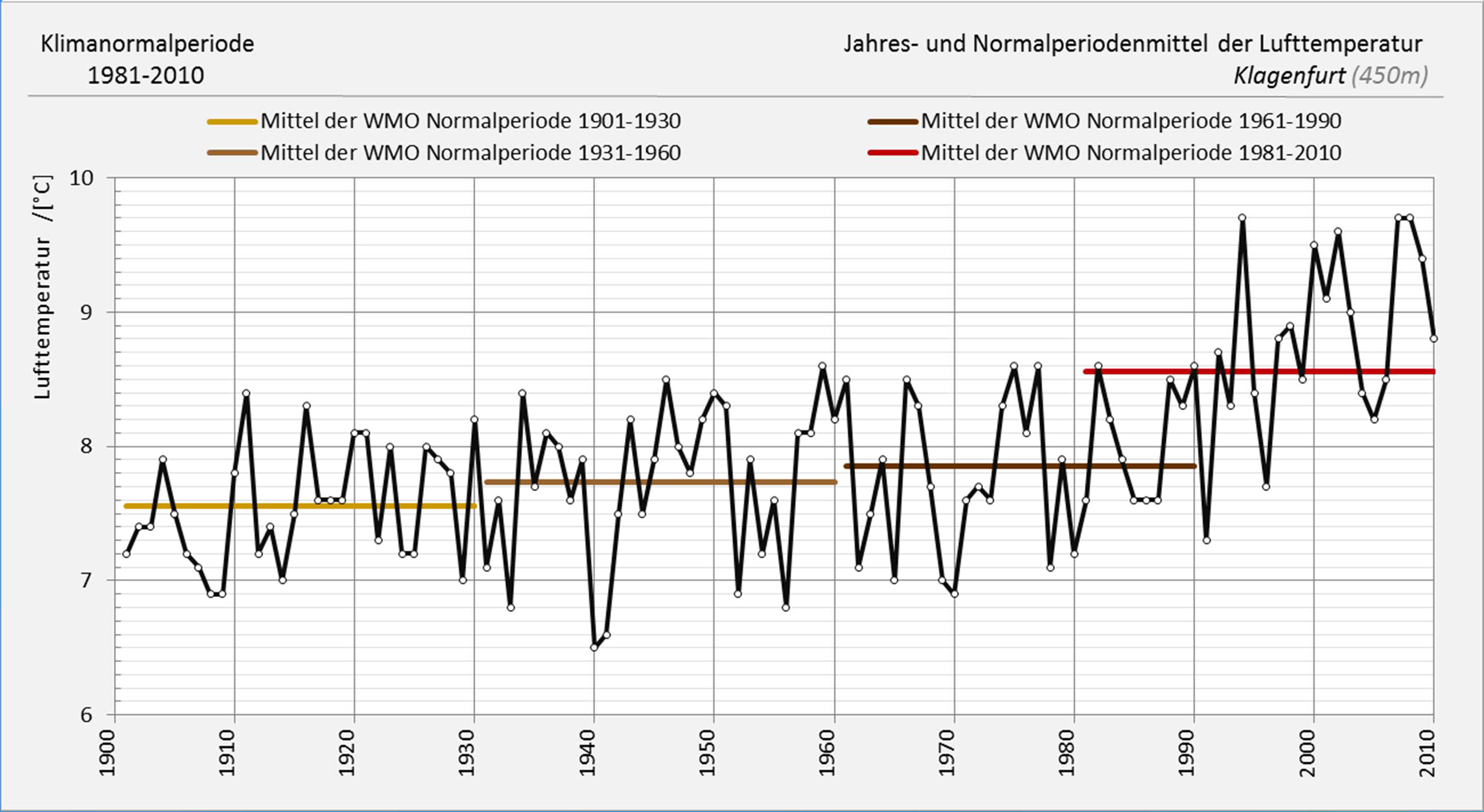
The air temperature annual averages and normals for Klagenfurt, Austria. Image: Zentralanstalt für Meteorologie und Geodynamik. [Click to open a larger image in a separate browser tab.]
Note that the Austrians, in order to give a full 30-year period to date have calculated the last normal period starting in 1981, not 1991. This exposes the fundamental idiocy of the WMO normals system, in that in the ten-year overlap, each annual average can belong to two completely different normals. Here they are both again for comparison:
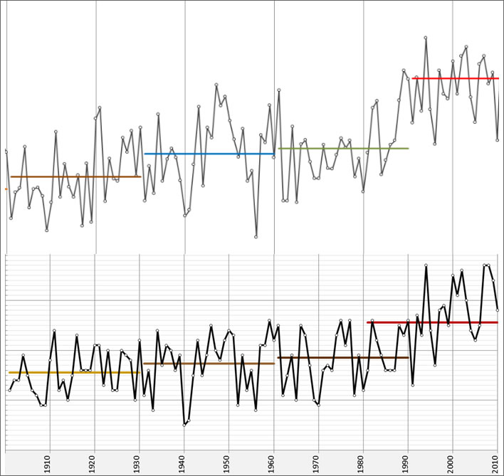
A comparison of the Swiss and the Klagenfurt temperature normals. The periods before 1900 and after 1910 have been removed from the Swiss graph. The absolute values of temperatures are not needed for the comparison, the vertical temperature axes are very similar scales. Top: All Switzerland; Bottom: Klagenfurt, Austria.
The mysterious surge that elevated the Swiss normals in the mid-80s is missing in Klagenfurt. Instead, the Klagenfurt temperatures peaked in 1994 for some reason, then plunged, then had a very small rally 1998-1999 whilst the rest of the world was groaning under El Niño. There are further hot swings whilst the rest of the world was pausing. Unfortunately, the final 30-year period stops in 2010, so we cannot see the effect, if any, of the El Niño of 2015-2016.
Just a glance shows that there is next to no correlation between the Swiss and the Klagenfurt graphs in the annual temperatures until we reach modern times: the amplitude swings of the Swiss graph are much greater than in the Klagenfurt graph and the only really common factor is the marked temperature plunge in 1940-1941. In most global temperature reconstructions (e.g. HadCRUT4 and NOAA) these two years appear as warm events. The pronounced plunge in Austria and Switzerland may therefore be a wartime artefact affecting data collection:
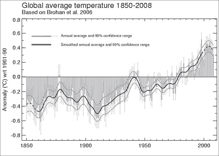
Global average temperature 1850-2008, based on Brohan et al. 2006. Match this to the normal period graphs if you can. Note that the temperature anomaly increase in nearly 160 years was 0.8°C, the normals increase 1.8°C. By the way, don't bother looking for Pinatubo or the El Niño. They are not there – yet another global warming graph gone pop. Never mind: just admire the 95% confidence ranges. Image: WMO / Met Office Hadley Centre, United Kingdom.
In the latest normal period the Swiss and the Klagenfurt graphs both show a marked temperature peak in 1994, but apart from that there are only a few broad-brush similarities. A superficial look at the three normals from 1900 to 1990 shows striking similarities – three small steps with only a little temperature increase – but the erratic and wild differences between the annual temperatures for the two places inspires no confidence that these are anything but statistical artefacts: if you muddle enough averages together the result is uniform muddle.
If we take the latest normals in the Swiss and the Klagenfurt graphs as representative of warming, suppressing our wonder at the remarkable step changes that occurred just around the time when the global warming craze was starting really to take off, we have to say that if there is a real warming being shown here, it is certainly not global. In fact it looks more like someone who doesn't understand statistics messing around with a pencil and the back of an envelope.
CAGW made manifest
Mr Climate presented the Swiss normals graph under a photo of the Palü glacier in Val Poschiavo with a line showing its extent in 1850 compared with the present day. 'A clear sign of warming' he tells us:
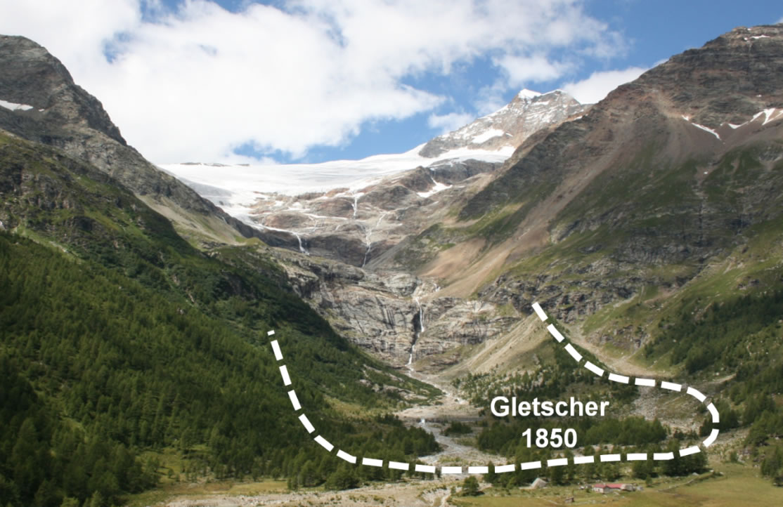
The Palü glacier in Val Poschiavo, Graubünden, Switzerland. The dashed white line indicates the extent of the glacier in 1850. Image: MeteoSchweiz. [Click to open a larger image in a separate browser tab.]
Since the early industrial period of 1864–1900 the temperature of the normal period has risen by 1.8°C. In the first 100 years warming has been moderate in comparison with the wild development between the normal periods 1961–1990 and 1991–2020. Careful observers of nature have not failed to notice this warming jump. The retreat of glaciers in the Alps has been accelerating in recent years. The glacier ice is disappearing before our eyes.
MeteoSchweiz. Strictly speaking the period 1864–1900 is not a normal period as defined by the WMO. It is also 36 not 30 years long.
'The retreat of glaciers in the Alps has been accelerating in recent years'. Really? Let's look at the data for the glacier he used to illustrate his thesis: the Palü glacier.
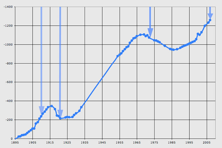
Changes in the length of the Palü glacier between 1895 and 2007 according to the Schweizerisches Gletschermessnetz. The arrows indicate the positions of the tongue of the glacier in 1910, 1921, 1972 and 2007 (images available on the source website). Image: swisseduc.ch, Glaciers online.
How he thinks the little trickle of warming (according to his own normals graph) that took place between 1860 and 1980, 0.7°C, caused an entire glacier to retreat by over a kilometre he does not tell us.
We find, though, that when we look at the great leap upward in temperatures in 1985 to which he explicitly refers, the poor old Palü glacier obviously didn't get the CAGW message and was extending for the twenty years between 1965 and 1985. After 1985, when the glacier started retreating once more, there is no discernable acceleration in the rate of retreat: if anything, the period after the turnaround in 1985 displays a deceleration. From the graph we also note that there had been an earlier reversal of direction in the ten years between 1915 and 1925. According to the annual temperatures for that period that he gives us there was a brief temperature peak in 1920-1921, but there is no reflection of this in the measured length of the Palü glacier.
Why do they do this? Why do people working for allegedly serious scientific institutions paid for largely out of public funds propagate this rubbish? He must have been drinking the green stuff again.
0 Comments
Server date and time:
Browser date and time:
Input rules for comments: No HTML, no images. Comments can be nested to a depth of eight. Surround a long quotation with curly braces: {blockquote}. Well-formed URLs will be rendered as links automatically. Do not click on links unless you are confident that they are safe. You have been warned!