![]()
Pollen quantity – yet one more sign of climate change
Richard Law, UTC 2019-04-17 11:15
We know that climate scientists and their activist fellow travellers frequently get their climate fairy stories in a twist, but a piece the other day in the Neue Zürcher Zeitung (NZZ) – once a sensible newspaper but now hopelessly infiltrated by red-green-academics and their camp-followers – demonstrated this in style.
The headline was the usual hell-in-a-handcart stuff: Das Gefühl trügt Sie nicht: So stark hat die Pollenbelastung in der Schweiz zugenommen 'Your feelings are not deceiving you: the pollen burden in Switzerland has increased'. The rest of the text did not disappoint, the main actor in this terror being, of course… climate change!
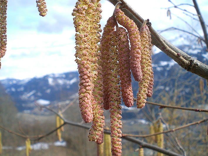
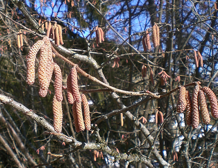
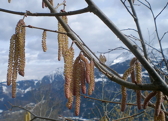
Hazel, February 2007. First out of the blocks every year. Image: FoS.
The trend to an increased level of pollen has been observed not just by researchers in Switzerland but throughout Europe. Climate change is also to blame for this development, says Regula Gehrig of Meteo Schweiz: 'The increased concentration of CO2 can have an influence on the quantity of pollen. Laboratory studies have shown that at higher CO2 levels the quantity of pollen increases.'
Den Trend zu einer erhöhten Menge an Pollen beobachten Forscher nicht nur in der Schweiz, sondern in ganz Europa. Schuld an der Entwicklung sei auch der Klimawandel, sagt Regula Gehrig von Meteo Schweiz: «Die erhöhte CO2-Konzentration kann einen Einfluss auf die Pollenmenge haben. In Laborstudien wurde gezeigt, dass bei höheren CO2-Konzentrationen die Menge an Pollen zugenommen hat.»
The careful reader trips over the emotional word Schuld, 'blame/fault' as well as the very scientific term kann, 'can', which is the best one can say of the 'laboratory studies'. Here we find one of the pea-under-the-thimble sleights of hand that are so characteristic of CAGW writing: the confident 'is to blame' becomes the thoughtful 'can'. Furthermore, Regula Gehrig is 'blaming' increased pollen on increased CO2 in the atmosphere, not climate change as such – we CAGW deniers are quite picky about putting horses before carts. Let's stunt the growth of plants so they don't overwhelm us with all that terrible pollen. Our climate scientist now goes into daydream mode:
At higher temperatures trees and bushes could put down more reserves, which they could use for the production of pollen. Gehrig: 'The more reserves, the more blossom.'
Bei höheren Temperaturen könnten die Bäume und Sträucher zudem mehr Reservestoffe anlegen, die sie für die Blütenproduktion einsetzen könnten. Gehrig: «Je mehr Reservestoffe, umso mehr Blüten.»
The paper she cites on the issue of CO2 as a driver for pollen production is in fact reticent about the possibility:
Despite the lack of unequivocally identified drivers, it is evident that there is currently a clear tendency towards an increase in atmospheric pollen, including highly allergenic taxa. These trends could not be attributed to rising temperatures, but may be influenced by the anthropogenic increase of the greenhouse gas CO2 as (experimental) studies suggest [18–24]. More research is needed in this area because a further worldwide increase in atmospheric CO2 is projected, e.g. by IPCC [32]. These changes may result in further increases in pollen amounts leading, in turn, to a greater exposure of humans to pollen allergens, with potentially serious consequences for public health.
The 'clear tendency towards an increase in atmospheric pollen' stated in the paper is yet another bit of climate science boastfulness, since most of their data only covers the last decade. 'Any trend in a storm!' At least they didn't forget to reach the obligatory conclusion: 'More research is needed'.
PLOS, p.5.
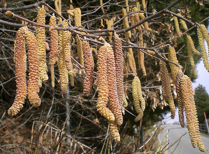
Hazel, February 2007. Lots of reserves being used here. Image: FoS.
Well, we all know that plants love CO2 and thrive in its presence, so quite what ominous threat a thriving plant-life represents for humanity is lost on us knuckle-draggers at this moment. Never mind, perhaps it will all become clearer as we read on.
Then Gehrig concedes that the CO2 effect is minor compared to other factors. Her justification is not at all empirical, just a statement of the bleedin' obvious:
Other human activities however would presumably have an even greater influence. 'Tress are planted in towns and woodlands. Birch, but also ash, hazel and alder are frequently found in towns. A change in the quantity of trees planted has an influence on the amount of pollen released', said Gehrig.
Andere Aktivitäten des Menschen hätten aber vermutlich einen noch grösseren Einfluss. «Bäume werden gepflanzt, in den Städten und in den Wäldern. Birken, aber auch Eschen, Haseln und Erlen findet man häufig in Städten. Eine Veränderung in der Menge der angepflanzten Bäume hat einen Einfluss auf die freigesetzte Pollenmenge», so Gehrig.
So let's just sum up this disastrous situation. Increased levels of CO2 are supposedly causing more blossom/pollen, which problem is made worse by these Swiss idiots planting trees everywhere they can. It's a good job trees consume CO2 so voraciously.
In order to explain the very real horror of blossomgeddon, we are shown some data for hazel pollen:
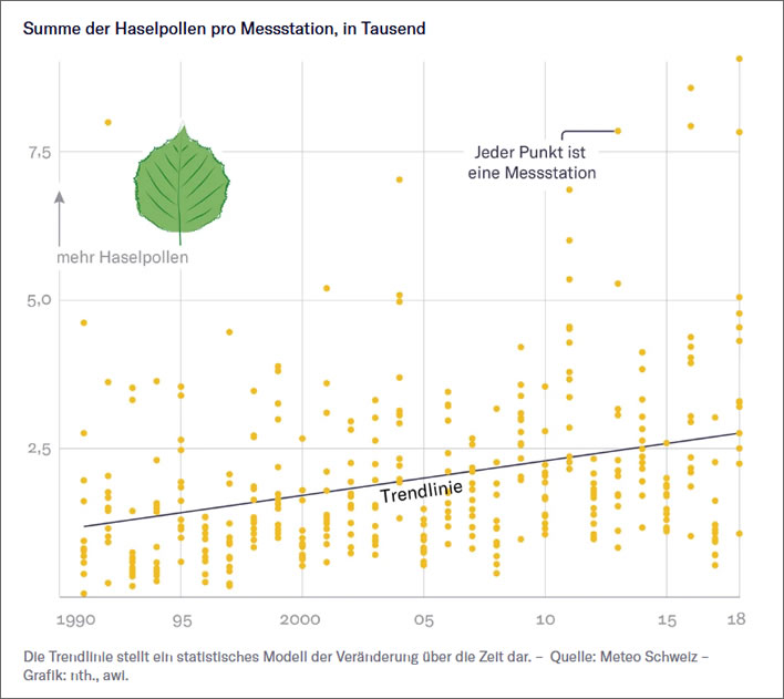
Image: NZZ
When we look at this graph we recall that one of the key problems of statistical analysis is what to do with outliers.
The name 'outlier' explains the problem: is the value 'representative' or has something gone wrong? Have local factors caused this outlier and if so, should we count them or should we ignore them? Isn't that just cherry picking? Without that wild result in 2018 the trendline would be flatter.
The presence of outliers also indicates the vulnerability of the measurement method to disruption. In this case we have a scatterplot in which close to half of the 14 measurements in each year could arguably be considered to be outliers. The variability between stations is enormous. How can one account for this? This scatterplot doesn't tell us anything about the variability of the results from the same station: the top value in 2018, for example – where was that station in 2017?
If you discount the 'wild' results at the upper edge of the graph the trendline would be flat – or close to it. In other words, the upwards trend seems to be entirely the result of outliers.
And ultimately, whatever trendline you choose to draw, remember that this is all the data we have. Switzerland is a European leader in pollen counting; most other European countries either have no pollen counting programme at all, or have one that has been running for only a few years. Deriving trends from such short periods is statistically irresponsible.
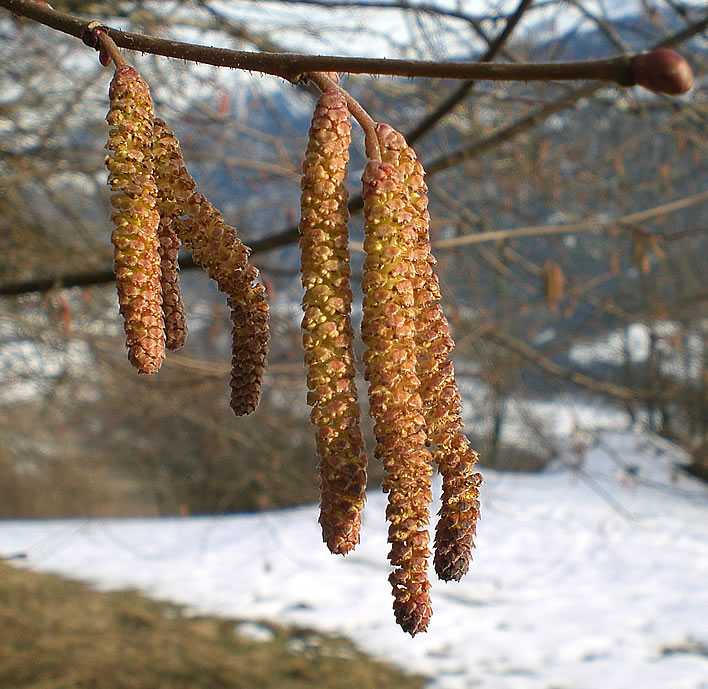
Hazel, February 2007, the snow still on the ground. Image: FoS.
We also have to remember that a machine may collect the samples, but it is a human who looks at the collection and identifies and counts a sample of the various sorts of pollen. We also have to remember that what is being measured here is the quantity of pollen arriving at the instrument, which, considering all the intervening weather factors, particularly rain and wind (intensity and direction), is definitely not the same thing as the amount of pollen released.
Presumably – we are not told – the counts are for each season and will be influenced by the length of that season in any particular year. Even more worrying is the fact that the data is collected in week-long segments. After that there will be the usual statistical abracadabra of averaging and smoothing.
After showing us hazel as the exemplar of the blossomgeddon that is already upon us, Gehrig turns to other airborne pollen types:
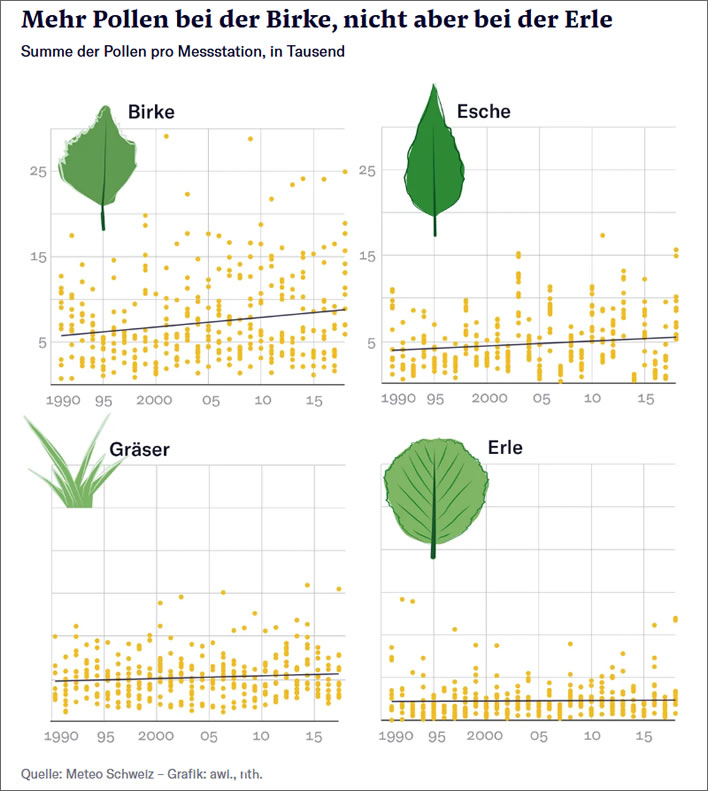
Image: NZZ
'More pollen from the birch (Birke), but not from the alder (Erle).' When we look at the scatterplot for birch we find a trend which, like hazel, is dependent on outliers. The plants that show little or no changes in pollen counts – the ash (Esche), grasses (Gräser) and alder – all lack these wild outliers. How can this be?
Rather late in the day, Gehrig accepts the limits to her knowledge:
Why the hazel in particular is releasing more pollen, she did not know.
Warum genau die Hasel mehr Pollen ausstösst, wisse sie aber nicht.
Still, whatever it is, it must be something to do with climate change. Our ignorance in sum:
'The intensity of the pollen season is very complex and influenced by many factors. It is therefore almost impossible to give an explanation for the observed changes.'
«Die Intensität der Pollensaison ist sehr komplex und von vielen Faktoren beeinflusst. Es ist deshalb fast nicht möglich, die eine Erklärung für die beobachteten Veränderungen anzugeben.»
It's a pity we weren't told this at the very beginning. All we heard then was about climate change and CO2. The author of the 'data report' chose to put the hazel scatterplot, in itself an outlier compared to all the others, as the principal example of his climate change fantasy, supported by Gehrig's babble.
After confessing that she has no idea why these measurements of pollen intensity are the way they are, Gehrig changes tack and goes down that favourite route for the climatistas in Meteo Schweiz, the dates of blossoming.
Once again we begin with the certitude of the true believer:
Climate change is not only responsible for the increasing quantity of pollen, but also for a tendency for an earlier start of the pollen season, said Gehrig of Meteo Schweiz. 'The higher the temperatures in the two months before the start of the blossoming season, the earlier the pollen season begins.'
The trend to an earlier start is shown most clearly in the case of grass pollen. The mean start of the season has changed from the beginning of May to mid-April.
Der Klimawandel sei nicht nur für die steigenden Pollenmengen, sondern auch für eine tendenziell früher beginnende Pollensaison verantwortlich, so Gehrig von Meteo Schweiz. «Je höher die Temperaturen in den zwei Monaten vor Blühbeginn sind, umso früher beginnt die Pollensaison.»
Der Trend zu einem früheren Beginn zeigt sich am deutlichsten bei den Gräserpollen. Der mittlere Saisonstart hat sich hier von Anfang Mai auf Mitte April verschoben.
So much certainty, so little knowledge. Having confided in us sotto voce that she in fact knows nothing about the factors governing the quantity of pollen in the atmosphere, she (or the author – as usual its difficult to tell in these bait and switch articles) now asserts with complete confidence that climate change is 'responsible for the increasing quantity of pollen'. If that statement did in fact come from the activist author and not the activist 'scientist', she should have demanded a correction PDQ. She didn't – let's not forget that her salary depends on these scary assertions.
Then another confident assertion: climate change is responsible for 'a tendency for an earlier start of the pollen season' followed by another graph with a title of foreboding: 'The pollen season for grasses is beginning earlier':
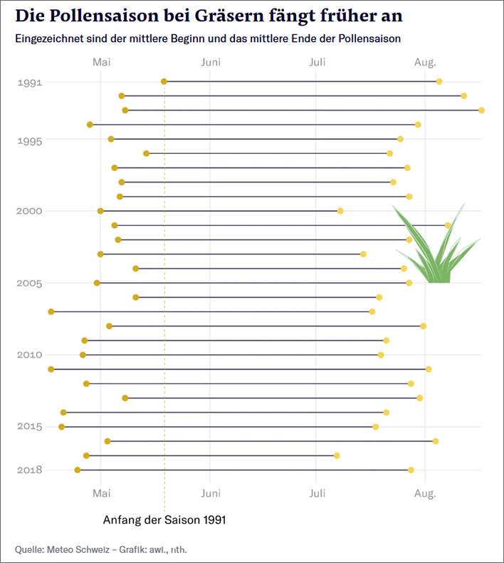
Image: NZZ
[Correction: the original paragraph here stated that the other charts started in 1990, whereas this chart starts in 1991. This was incorrect. The others start in 1991, too, but the date of the first entry is not explicitly declared and difficult to see on the chart.]
The fact is that the graph begins in the year in which the very latest date for the start of the grass pollen season was recorded – after that there is only one way to go: earlier. Let's draw a vertical line down from this point and mark it 'beginning of the season 1991', just in case any slow person does not realise that all the other values start earlier.
So, this is what she meant by 'from the beginning of May to mid-April'. Unless my eyes or more likely the drawing of the axes deceives me, 2018 started closer to the end of April than the middle.
If you had started the graph at 1994, however, the shift would have been from late-ish April to late-ish April. If you had started the graph at 2007, the grass pollen in 2018 would have started a couple of weeks later and we would have even been able to argue that the start of the grass pollen season was actually getting later, probably because of CO2 or catastrophic anthropogenic global warming or something or other.
The situation becomes even more problematic for Gehrig and the author's core message when we see the graph of the start of the hazel pollen season. The hazel, which had so loyally delivered that unambiguous global warming signature in Gehrig's first graph, now lets her down completely:
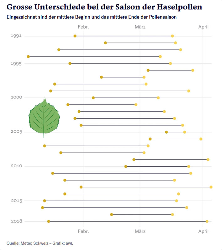
Image: NZZ
Despite starting this graph in 1991, not 1990, no alarming excitement can be made of it. The only way to get this data back on message is to waffle:
There is no clear trend with the other pollen varieties. Despite that, said Gehrig, there is an earlier begin to the season for birch, ash and hazel. 'The annual variations in the season start are very large however, so the earlier starts are not statistically significant.'
Bei den übrigen Pollenarten fehlt ein klarer Trend. Trotzdem gibt es laut Gehrig auch bei Birke, Esche und Hasel einen früheren Saisonstart. «Die jährlichen Schwankungen im Saisonstart sind aber sehr gross, so dass die Verfrühung statistisch nicht signifikant ist.»
Sane readers who are still awake will have a solution ready that could ease Gehrig's puzzlement over this erratic behaviour of hazel. If a tree produces its pollen in a period of transition from meterological winter to meterological spring (December to April for hazel), it is going to be vulnerable to the dramatically large swings of weather that occur during that period and it will have to respond accordingly. Plants that produce their pollen later are doing so in weather conditions that are relatively unlikely to swing into extremes of frost and snow.
It's amazing that in the topsy-turvy world of climate science it is possible to have 'no clear trend', but 'despite that … there is an earlier begin to the season for birch, ash and hazel', so that must be climate change, mustn't it?. The reader has got Gehrig's message and can stop reading now. What? Just one more sentence? After all these confident assertions we note that: 'the earlier starts are not statistically significant.'
Coming back to hazel pollen, our climate change champion, once more we can see that there are 'ever more days with a lot of hazel pollen':
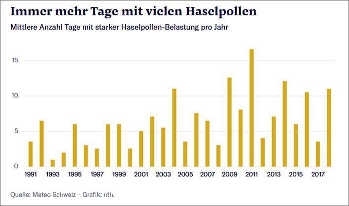
Image: NZZ
Well, sort of. Looking at that chart the sane person would say there were three peaks, in 2004, 2009 and 2011. In between those everything is much of a muchness. We hideous deniers are arguing that actually, since that peak in 2011, over the remaining seven years the mean number of days with 'high' hazel pollen counts has been reducing. 2017 was even one of the years with the lowest values since 1991. Is this the face of Catastrophic Anthropogenic Global Warming showing itself in the pollen counts? Hmm. Never mind, the assertion of the climate scientist stands: 'there are 'ever more days with a lot of hazel pollen.'
Hazel, February 2007. Image: FoS.
If we use the data on this theme available on the Meteo Schweiz website, we realise just how erratic the source data in fact is. Here are the measurements of hazel pollen for Luzern for 2008, the earliest record they publish. I have selected Luzern more or less at random. Meteo Schweiz does not seem to publish the data for Switzerland as a whole.
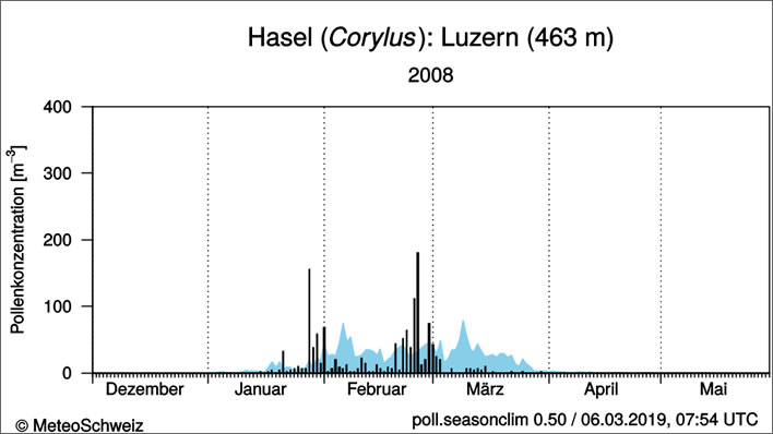
A poor year for hazel: an early start in January, then a setback until the end of February; all in all a low pollen output.
The plot shows median daily pollen concentration (quantity of pollen per cubic metre) for the selected year. The blue curve is the 25 year median values. The y-axis, the pollen concentration, has been cut off so that the lower values, which are relevant for people with allergies, remain visible. Image: MeteoSchweiz.
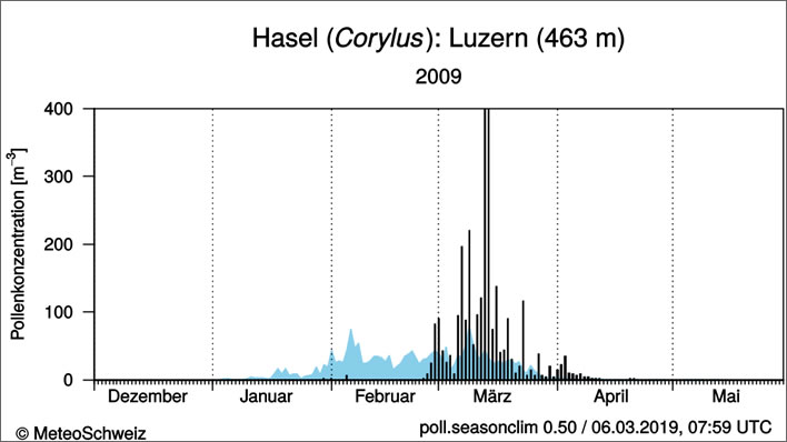
The following year displays a later season in March, but an output of pollen that goes off the scale (the values have been truncated).
Comparing the 2008 and the 2009 graphs shows us just what we are up against when we try to derive statistical meaning from such variable data. How the climate scientist can bring herself to draw a straight and rising trendline through this data defeats all understanding. Image: Ibid.
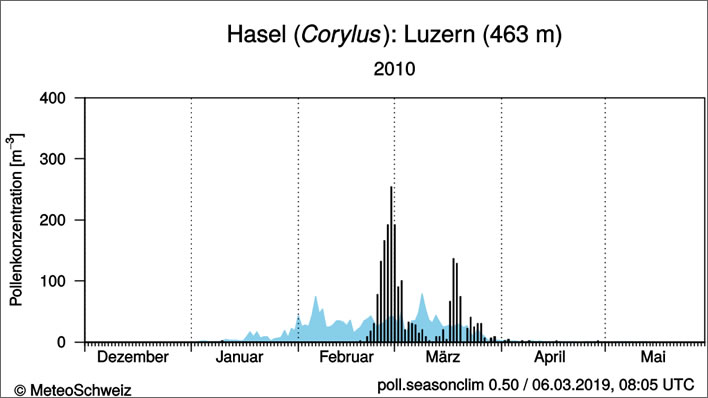
2010 was on the whole a poor year for hazel, which started weakly at the end of February then faded until mid-March, when it produced a weak rally. Image: Ibid.
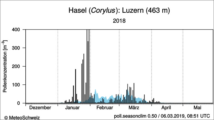
The 'outlier' year of 2018. An early start, then a setback, then a large output that goes off the scale, next to nothing in February, followed by a weak rally in March. Image: Ibid.
Make of all that what you will. Looks like weather to me – always good for a surprise in the first quarter of the year.
Hazel, February 2007. This plant has the power to reduce your author to being a red-eyed, sniffling wreck with a grinding headache and a face that feels as though it is about to explode. Fortunately, Big Pharma has brought us those wonderful little white pills that now permit him to take photographs like this one and live. Image: FoS.
0 Comments
Server date and time:
Browser date and time:
Input rules for comments: No HTML, no images. Comments can be nested to a depth of eight. Surround a long quotation with curly braces: {blockquote}. Well-formed URLs will be rendered as links automatically. Do not click on links unless you are confident that they are safe. You have been warned!