![]()
A Swiss simpleton's guide to Global Warming
Richard Law, UTC 2019-09-29 14:28
It's been a tough year so far for the institutionalised climate alarmists in the Federal Office for Meteorology and Climatology. Apart from providing increasingly frantic weather forecasts (SNOW! RAIN! WIND! HEAT!), the MeteoSwiss website features a 'climate blog', which reports on the developments in the Swiss climate on a roughly monthly basis.
That frantic frequency of reporting on something that is traditionally assumed to have a thirty year scope is a bit of an oddity for a start.
As mentioned, 2019 has been a tough year so far for climate alarmism. They swerved the unseasonable, substantial snow in May ('cool May') but were able to 'scweam and scweam until they were almost thick' at a couple of brief-heatwaves in – would you believe it? – summer.
A bit of calm descended during the unremarkable weather in August and September and no further drama seems to be on the climate horizon, so the Elisabeth Violet Botts on the MeteoSwiss blog had to find something else to write about.
After the stunning success of their last we-are-all-going-to-die movie, it was time to whack us climate Neanderthals in Switzerland (a dying race) with some more shock and horror. Here it is:

Beobachtete und zwei mögliche zukünftige Entwicklungen der Schweizer Temperatur von 1864-2099, 'Observed and two possible future developments of Swiss temperatures from 1864-2099'. Image: ©MeteoSwiss. [Click to open a slightly larger version of the image in a new browser tab.]
Well, that's a clear message that even a thicko climate Neanderthal can understand: cold before 1990, then progressively boiling hot for the rest of the century.
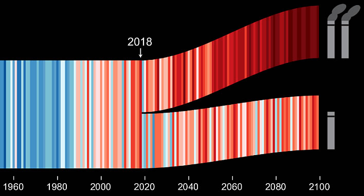
The trouble is that we climate Neanderthals are so thick that we cannot even understand this simple message. We start asking questions that only serve to put our ignorance on cruel display: How is it, we wonder, that 2047(?) is a cool year that is followed by two much hotter years? I mean, what supercomputer has worked out the average temperature anomaly for each year until the end of the century? How can anyone possibly know this? If this supercomputer can do that, why can't it tell us what is going to happen next month?
The answer seems simple. No energy-devouring, multi-million dollar supercomputer came near the results from 2018 onwards, but a box of colouring pencils was all that was needed. These would have done the job nicely for 19.95 CHF and left taxpayers delighted.

Following the principle that that some years are diamonds and some stones, some young person in MeteoSwiss got the job of colouring in the years to 2100.
We climate Neanderthals are also puzzled by what happens in 2018. The 'temperature axis', if you like, is represented solely by colour – until, that it, 2018 when the stripes begin to follow some unspecified y-axis of increasing temperature. They probably have to do that because we are too thick to comprehend that colour accords with temperature.

Once we climate Neanderthals start puzzling about colours and values for temperature anomalies, we look more closely at the colour table in the legend – which also turns out to be beyond our limited understanding.
We might assume that white represents an anomaly of 0°C and in making that assumption it seems that we are right.
But to the left of the white dot there are six dots of increasing blueness which cover the two degree range 0..-2°C. There are eight dots of increasing redness to the right of the white dot which cover the four degree range 0.. +4°C. +4°C?
The more we grunt and scratch our Neanderthal skulls, the odder it all seems, because the distribution of the colours in the temperature scale as a whole is extremely non-linear. On the blue side, two dots cover 1°C, the remaining degree requires four dots. On the red side, five dots cover 3°C. Or at least this Neanderthal thinks so, because the labelling of the dots is so bizarre that a conspiracy theorist might conclude that this was done deliberately.
And why does this matter? It matters because it allows the climate scientist who is drawing these completely imaginary future stripes with a coloured crayon to pile on the red and with it the drama. In the lower strip, representing a reduced or controlled emissions scenario, the warming is softened by interspersing some white and pale blue.
And how does MeteoSwiss justify the slight of hand of inventing completely fictitious annual temperature anomalies for the next 80 years or so? You wouldn't know it from the main title in a large font at the top of the graphic, but if you follow the tiny asterisk down to the tiny text in grey on black along the bottom of the graphic you will read the weasel words in English: 'exemplary development 2019-2099'.

Their English is as bad as their climate science, since, of course, they don't mean 'exemplary', that is a 'false friend' from German. In English it means 'serving as a desirable model; very good.' (OED), they mean… well, we climate Neanderthals don't know either – there is no English word or phrase for 'making something up that looks true and pretending that it is true', apart from, perhaps, 'fakery' or similar. On the basis of this fakery, we get the usual fake conclusion:
If one looks more closely at the data represented in the graphic, one sees that, with thorough-going climate protection, in Switzerland up to the middle of the 21st century about a half and by the end of the century even about two-thirds of the climate warming can be avoided. The points will be set in the near future.
Schaut man noch etwas genauer in die dargestellten Daten, so erkennt man: Mit konsequentem Klimaschutz lassen sich in der Schweiz bis Mitte des 21. Jahrhunderts etwa die Hälfte, bis Ende Jahrhundert gar zwei Drittel der Klimaerwärmung vermeiden. Die Weichen dazu werden in der nahen Zukunft gestellt.
Note that, after 2018, no data at all is represented in this graphic. And note too, that plucky little Switzerland's sacrifices for 'thorough-going climate protection' will make no measurable difference to global temperatures at all.
0 Comments
Server date and time:
Browser date and time:
Input rules for comments: No HTML, no images. Comments can be nested to a depth of eight. Surround a long quotation with curly braces: {blockquote}. Well-formed URLs will be rendered as links automatically. Do not click on links unless you are confident that they are safe. You have been warned!