![]()
Hotting things up in the USA
Posted by Thersites on UTC 2018-01-19 15:20
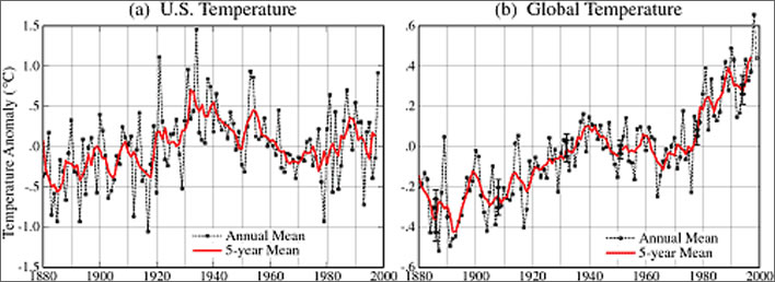
In 1999 James Hanson, the father of the Catastrophic Anthropogenic Global Warming (CAGW) scare, wrote a paper dealing with a little problem with CAGW theory. Although during the period 1880-1999 global atmospheric temperatures had been rising nicely – apart from a forty year glitch between 1940 and 1980, the atmospheric temperatures in the USA had not been behaving themselves at all – apart from a blip around 1990 they had declined steadily since 1940, leaving, as far as the USA was concerned, CAGW theory in tatters:
For the obsessives, here are the two graphs in greater detail (click on an image to open an even larger version in a new browser tab):
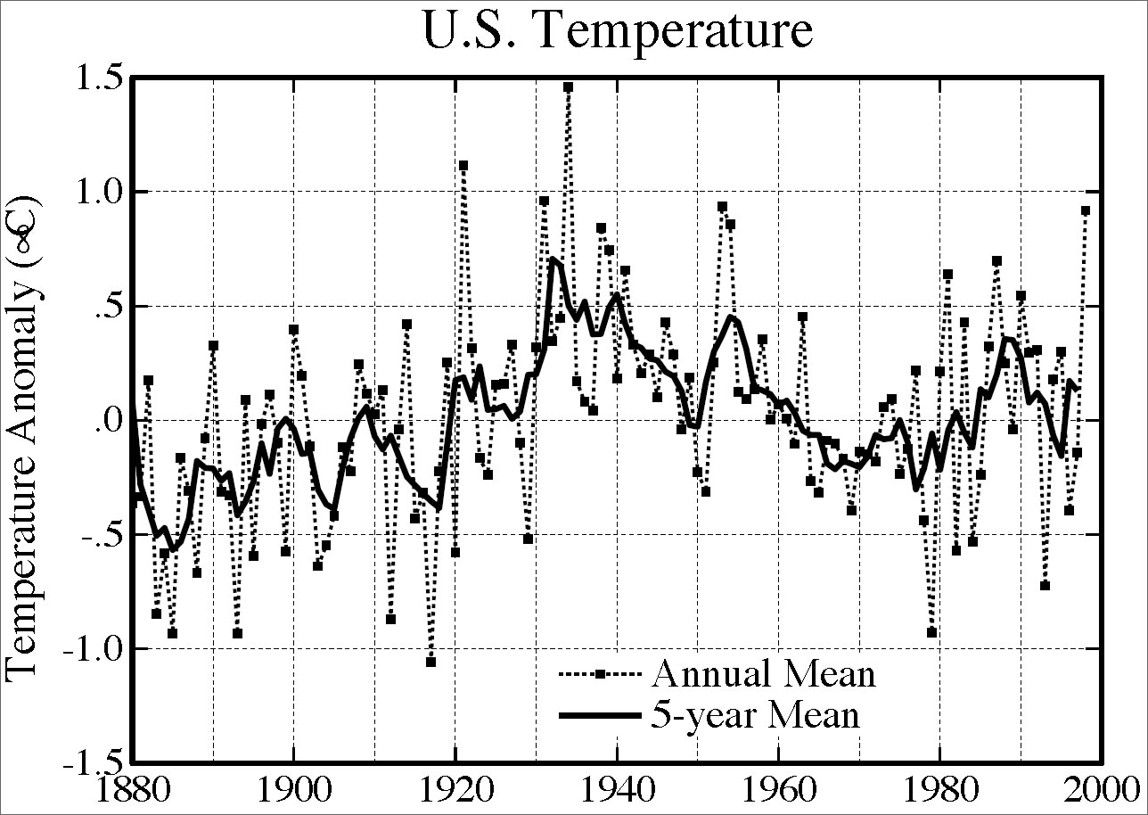
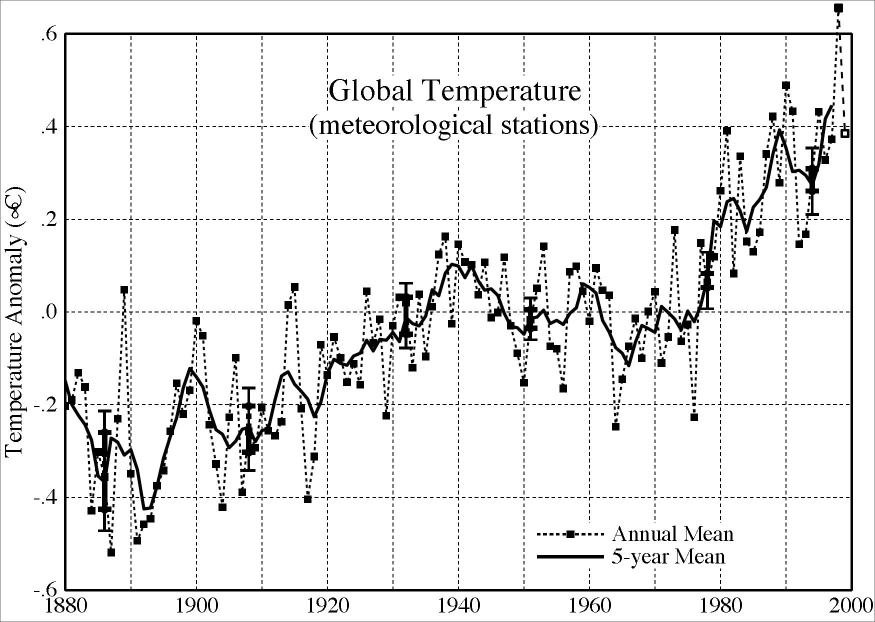
Now, dear reader, we are dealing with the work of climate scientists, so from bitter experience we have to be very, very careful when looking at the graphs they produce. These two similar looking graphs are really very different. The sharp eyed will notice that whereas the scale of the USA graph runs from -1.5..+1.5°C, the scale of the global graph only runs from -0.6..+0.6 – that is, the global temperature graph on the same scale as the USA graph would be much flatter: it would move largely between the -0.5..+0.5 gridlines of the USA graph. Hansen is here doing the classic climate science trick of stretching the y-axis to enhance the slope of the curve, thus misleading the casual or unwary observer. Conversely we could argue that he has compressed the y-axis of the USA chart, making the oscillations seem less dramatic. Remember that we are dealing with anomalies, which are inherently suited to such sleight-of-hand.
Now, most sane scientists would look at the two graphs and think: the USA data comes from a huge number of mostly very reliable and mostly well-sited climate reference stations. The global data comes from a relatively small number of often very badly-sited climate stations – only one or two in a country, if at all, and often just located next to airport runways or close to the centre of cities. There are great blanks without any instruments at all in Africa, Russia, China, South America and, of course, the Arctic and Antarctic.
Consider lonely instruments such as that at Svalbard airport, on a Norwegian island in the Arctic at 78°N. Only a few decades ago Svalbard consisted of a few frozen huts and a fit-up airstrip. Since global warming, arctic sea-ice and polar bears became fiery topics of interest for researchers and tourists, Svalbard has become a sizeable colony with a busy airport and a climate station planted next to the tarmac. The thermometer there, regularly wafted with jet exhausts, is used to inform us of the temperature of thousands of square kilometres of the Arctic.
As a working hypothesis, the sane scientist would assume that the data for the USA was inherently more trustworthy than the global data; the task would then be to work out why the global data diverges from the USA.
The insane climate scientist looks at the global plot, notes that its more or less continuous temperature rise reinforces CAGW theory and thus assumes that it is that graph which represents reality. It must be true. The task is therefore to work out why the USA graph, despite its data coming from many top-class stations, is so wrong.
Even the title of Hansen's 1999 paper, 'Whither U.S. Climate?' leaves us in no doubt where the problem lies. Hansen wonders, for example, why the USA is colder than everywhere else. But the real long-term solution to the problem, of course, is to change the data:

There, that's better now, isn't it? By the time we get to 2018 the problem has been adjusted away. The USA plot is now very like the global plot. So easy! here's the 1999 USA plot overlaid with the current version for your delectation:
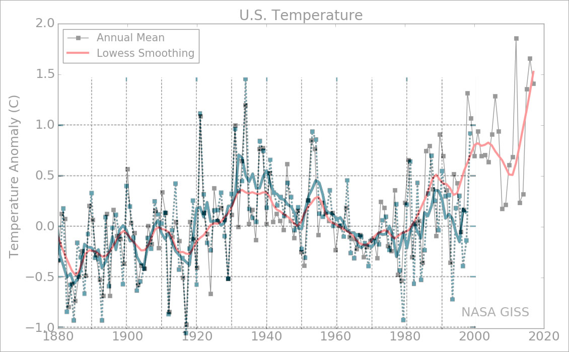
The heat record in 1934, in the middle of the very hot 1930s, has lost its laurels to more recent hot years – how boring it would have been to have to announce every year that the hottest year was in fact 1934.
After 1970 the adjusted and improved temperatures start picking up so that by the time we get to recent decades – abracadabra! – we have unequivocal (to use the MeteoSwiss word) global warming. Oh, by the way, whilst we are at it, let's take the start of the reference for that unequivocal global warming as 1950, that cluster of cold years that have been made even colder now, guaranteeing the steepest possible ascent to the modern record annual temperatures. A win at every level!
This article was triggered by a recent posting by the estimable Paul Homewood on his blog Not a Lot of People Know That. Paul's posting is more detailed and is well worth reading independently of ours.
0 Comments UTC Loaded:
Input rules for comments: No HTML, no images. Comments can be nested to a depth of eight. Surround a long quotation with curly braces: {blockquote}. Well-formed URLs will be rendered as links automatically. Do not click on links unless you are confident that they are safe. You have been warned!