![]()
Three against COP26.
Richard Law, UTC 2021-11-03 02:01
We who reject the alarmism of the Catastrophic Anthropogenic Global Warming (CAGW) movement just have to grit our teeth during each COP climate jamboree: we know full well that we will be bombarded from every side with hysterical hyperbole.
The one advantage is that the uproar serves to remind us just who the stupid and/or malign ones of the great and the good in Glasgow are – and just how many of them there are. Even the grumblers preface their remarks with a declaration of belief in CAGW.
Once the idea that the carbon dioxide emitted by human actions is causing the Earth's atmosphere to warm to dangerous levels has been accepted as gospel, climate activists seem to have no inhibitions about saying anything, however wild, that reinforces this idea. What they say may be hysterical nonsense, but their heart is in the right place, so that's alright then. The end – saving 'the planet' – justifies the means.
The text that follows is a simple, three point refutation of the idea of CAGW. You don't need a weatherman to tell which way the climate goes, nor do you need to confront the loud litany of all the things that are supposedly going wrong because of CAGW. It is all nonsense, since the basic idea on which it all rests – that carbon dioxide emissions are dramatically warming the Earth's atmosphere – is utter nonsense.
1– Ignorance is bliss
This is a graph of atmospheric temperature anomalies over the last 10,000 years, that is, from the end of the last ice to the present day, the Holocene geological epoch. It expresses the current state of knowledge about this subject. There are other graphs, with somewhat different results (see the 2017 WUWT discussion on Greenland proxies) but in general this graph represents well the consensus view of historical and pre-historical air temperatures. Readers will surely raise their eyebrows in shock when they spot the terrifying warming of the modern period (marked 'Mann Hockey Stick')
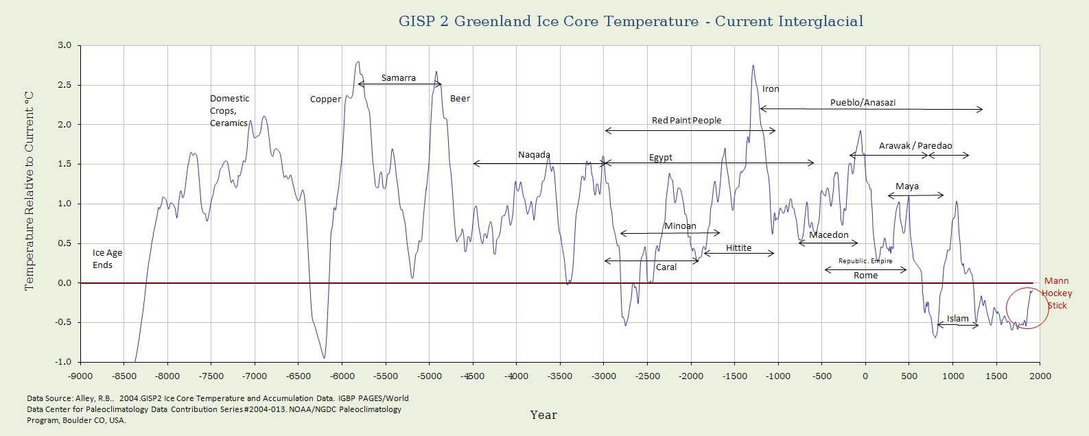
Alley, R.B., 2004 GISP-2 Ice Core Temperature and Accumulation Data, IGBP PAGES / NOAA/NGDC Paleoclimatology Program, Boulder CO, USA. Image downloaded from WattsUpWithThat.
Richard Alley, the author of this temperature reconstruction, happens to be an unreconstructed warmist fanatic. He added the spike of thermometer warming at the end of his reconstruction in deference to his colleague Michael Mann's infamous 'hockey stick' graph with its scary thermometer 'blade'. Why anyone would think this little blip is a harbinger of mankind's impending climate doom is a mystery to your unimaginative author. [Click on the image to display a larger version in a new browser tab.]
The broader context of the graph is also important. For about one million years before the period covered by this graph, what has been called the 'Icehouse Earth' was a very cold world indeed. For most of this period the Earth experienced an ice age. This underlying ice age was interrupted by several 'interglacials' – relatively brief periods of warm weather.
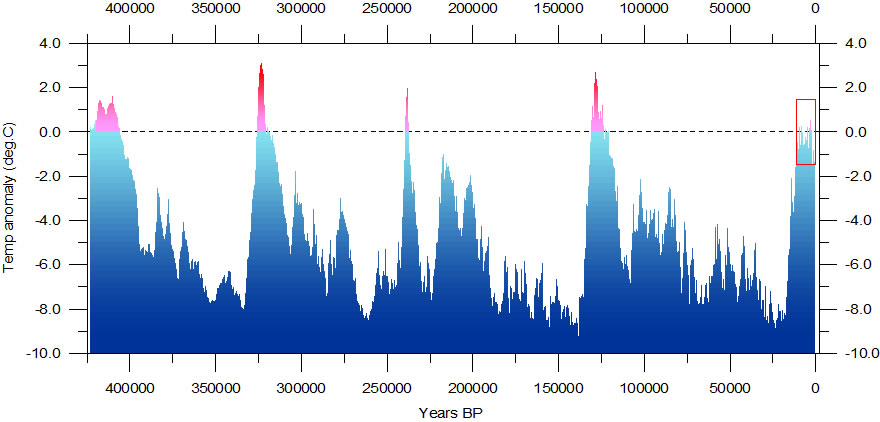
Reconstructed global temperature over the past 420,000 years based on the Vostok ice core from the Antarctica (Petit et al. 2001). The record spans over four glacial periods and five interglacials, including the present. The horizontal line indicates the modern temperature. Image: Prof. Ole Humlum, climate4you.com [Click on the image to display a larger version in a new browser tab.]
We are currently some way into the interglacial characterising the Holocene epoch. It is marked with the red rectangle in this graph. How long the present interglacial will last is something that no one knows. The transition between cold and hot world can be relatively rapid, so that if you have nightmares, the end of our current interglacial would make a good one.
The graph of temperatures over the last 10,000 years is, in effect, a close up of the top of our present interglacial.
Climate scientists distinguish a number of warm (and alternating cold) periods in this Holocene temperature record. Compared to the temperature abyss of an ice age, these variations are mere flickers. As we have noted, nothing is completely certain about this Holocene temperature reconstruction, but the warm and cold periods seem to correspond with identifiable historical periods and thus make a broader and seductive sense in terms of anecdotal evidence.
As suggested in the annotations on this temperature reconstruction, the warm periods were times in which the civilisations of Europe flourished. The Minoan Warm Period saw great migrations across the Mediterranean region and the glory days of Greek civilisation. The Roman Warm Period ditto for the Roman Empire. In the Medieval Warm Period troubadours wandered the long roads of Provence and the Renaissance began with the recovery of those scraps of the Ancient world that had managed to survive the Dark Ages. Trade flourished (since travel was easier in a warm world) and the rulers of Europe came down from their castles into the bustling towns and cities of the new awakening.
We, too, are currently in a warming phase, but so far the warming does not seem to have reached the levels of earlier warm periods. This fact alone should make us stop and consider whether alarmism about the future of our balmy climate is at all justified. Although we are not quite as dependent on the weather as our ancestors were, we could argue that the warming world which we inhabit has also been a time of great civilisational progress that matches or even exceeds that of preceding warm periods.
If the Holocene graph is correct then even the current panic value for temperature increase, 1.5°C, will only bring us into the range of the Roman Warm Period – and from there we still have some way to go before we reach the earlier warm periods. There is something to be said, in civilisational terms, for not having to wear clothes.
In contrast, the temperature dips between the warm periods have on the whole accompanied times of conflict, disease and cultural retreat or stasis. No sane person wants to return to the climate of the Dark Age – and certainly not to the conditions in the so-called Little Ice Age (LIA). As we progress along our current interglacial, temperatures are generally in decline and the cold snaps get colder. Let's hope another one isn't on the way.
Some people may take issue with particular points in this account, but on the whole the picture it presents is not controversial. A rational mind would see nothing in this graph that would justify even a mild apprehension about the future of mankind, let alone a feeling of impending climate doom.

Lovis Corinth, Diogenes [with his lamp, searching for an honest man], 1892 Image: Kunstforum Ostdeutsche Galerie.
With this graph of historical temperatures in mind, like crusty old Diogenes, who lived in a climate period in which one could dress in a rag (or not) and live in a barrel, let's take our lantern and go in search of honest climate scientists. When we have rounded up a group – it may take some time – we can ask them some questions about this graph.
- Q: What caused the Minoan Warm Period?
- A: No idea.
- Q: The Roman Warm Period?
- A: No idea.
- Q: The Medieval Warm Period?
- A: No idea.
- Q: The temperature drops in between the warm periods, particularly the LIA?
- A: No idea.
- Q: The recovery in temperatures since the end of the LIA? (say 1820)?
- A: Carbon dioxide.
The following is a simplified version of the same graph of Holocene temperatures, but this time with the addition of a graph of the concentration of carbon dioxide in the atmosphere, also derived from ice core data.
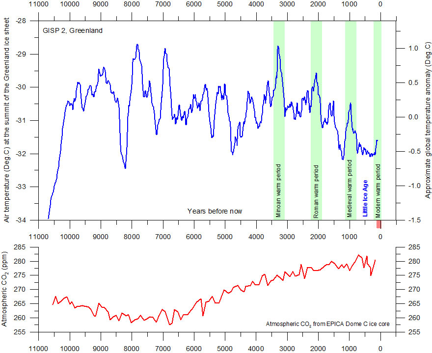
The upper panel shows the air temperature at the summit of the Greenland Ice Sheet, reconstructed by Alley (2000) from GISP2 ice core data. The time scale shows years before modern time. The rapid temperature rise to the left indicate the final part of the even more pronounced temperature increase following the last ice age. The temperature scale at the right hand side of the upper panel suggests a very approximate comparison with the global average temperature (see comment below). The GISP2 record ends around 1854, and the two graphs therefore ends here. There has since been an temperature increase to about the same level as during the Medieval Warm Period and to about 395 ppm for CO2. The small reddish bar in the lower right indicate the extension of the longest global temperature record (since 1850), based on meteorological observations (HadCRUT3). The lower panel shows the past atmospheric CO2 content, as found from the EPICA Dome C Ice Core in the Antarctic (Monnin et al. 2004). The Dome C atmospheric CO2 record ends in the year 1777. Image: www.climate4you.com/ [Click on the image to display a larger version in a new browser tab.]
Just these two graphs, taken together, are sufficient to destroy the carbon dioxide 'temperature control knob' panic. Reduce 'emissions' – why?
2– The Gretchen-Frage
The term Gretchen-Frage will be familiar to all fans of Goethe's Faust I. Dr Heinrich Faust is the great, bookish brain striving after total knowledge. In his despairing search he becomes entangled with the Devil, known here as Mephistopheles. Faust, who has been too busy up until now devouring his books to bother much about women, takes up with Margarete ('Gretchen'), a simple, pious girl who falls for Faust's lugubrious charms (with a bit of help from Mephistopheles).
As all sensible women would, Gretchen wants to know more about her suitor. In their conversation, Gretchen asks him: what do you think of religion? Faust, aware that an honest answer would imperil his chances with this pious chick, gives her the answer of intellectuals down the ages: 'yada yada yada yada yada yada ...' .
Gretchen may be a simple, uneducated and uncritically pious young woman, but she is not stupid. She probes further, this time with what has become the Gretchen-Frage: 'Do you believe in God?' in other words, a yes-no question that cannot really be answered by 'yada yada'. However, Faust can do nothing but issue a further torrent of 'yada yada' – and appears to get away with it. She should have believed the evidence of her ears – in the play she comes to a horrible end as a result of the machinations of Faust and his diabolical friend.
The Gretchen-Frage in climate science also demands a simple answer, in this case not a yes or no but a number. Here it is: What rise in atmospheric temperature will be caused by a specific increase in the concentration of carbon dioxide in the atmosphere? It is a Gretchen-Frage not only because it is a simple question that can only be satisfied by a simple answer, but also because all the immense amount of 'yada yada' about CAGW depends on it. As was the case with Gretchen, we should listen carefully to the answer to this question and assess its worth with great care.
The amount of carbon diode increase in question is expressed as a doubling of the current value. The doubling principle is traditional in spectroscopic absorption calculations, where absorptions are a logarithmic function, that is they increase rapidly then flatten to an asymptote. If you take a shot glass of water and drip black ink into it, the first few drops will produce a noticeable darkening. The twenty-first drop, say, will however have very little effect on the already very dark water in the glass.
So let us restate our Gretchen-Frage precisely: If the carbon dioxide content of the atmosphere doubles, what will the change in atmospheric temperature be? Remember, the whole of CAGW theory depends on this number, the entire alarmist case and the justification for the various COP jamborees, so have a little think before you answer.
The answer is simple: no idea.
Or, more precisely, we have numerous ideas ('yada yada' etc.), but none which we can say with conviction is correct. Here's a recent summary:
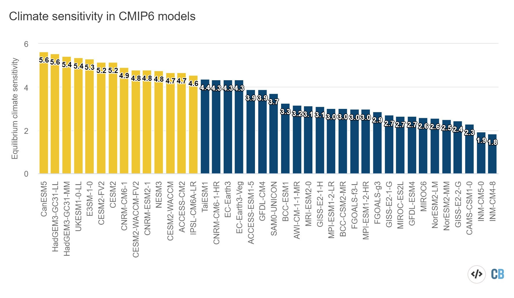
ECS values from the 40 CMIP6 models available as of May 2020 where necessary experiments to calculate ECS (using the Gregory method) are currently available. Models with an ECS above the IPCC AR5 likely range are shown in yellow. Note that not all models shown are independent, as some modelling groups – such as CESM2 – have multiple versions.
Zeke Hausfather, Carbon Brief, 'CMIP6: the next generation of climate models explained'. Image: Carbon Brief.
The atmospheric physicists in climate science have been hacking away at this question for around forty years, ever since carbon dioxide became a 'gas of interest' as it were. The fact that there are dozens of suggested answers (each from a respectable peer-reviewed paper, nota bene) covering a range from 1.8 [=harmless] to 5.6 [=danger], does not fill us with confidence – it really is just the equivalent of 'yada yada' a.k.a. 'no idea'. And that, too without error bars. If the error bars were displayed, that is, the range of values which were also in some sense probable, we could add around ±1.5°C above and below the values stated here.
A sane person looking at this wild spread of values for such a fundamental number with such far-reaching consequences would, when they had stopped laughing, sum it all up concisely: 'They have no idea'.
The commentary of the warmist presenting this shambles of ignorance can only be described as Faustian yada yada. The author states that the 'diversity' of results is a good thing, since it shows that the researchers are not just copying off each other. On the basis of no evidence at all – at least, none which is apparent in this chart – he finds the larger values 'more likely'.
'Delusional' is the only term that comes into an rational observer's mind. After forty years of effort the uncertainty is just as great and the spread of values even greater.
Here's a historical view of the search for the elusive climate sensitivity. Since more and more recent work is reducing the estimates for carbon sensitivity, the preference for the higher values expressed by the author of the previous chart really does seem delusional.
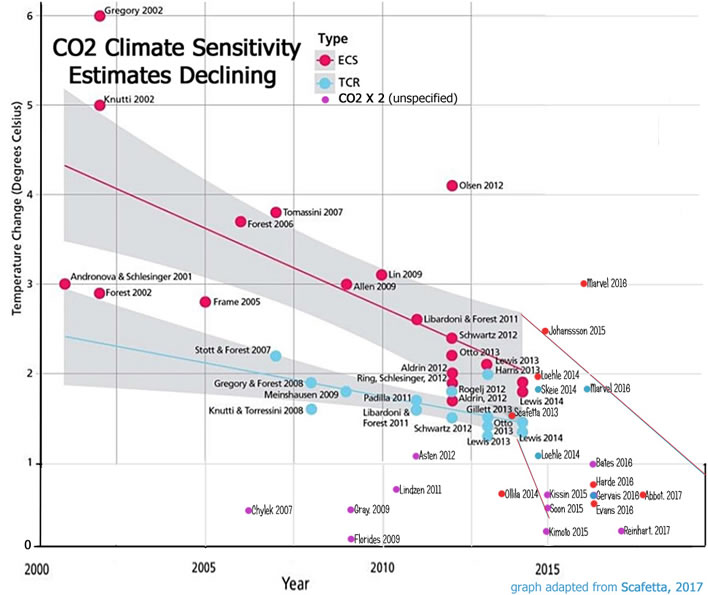
Base graphic adapted from fig. 7 in Scafetta, Nicola & Mirandola, Aberto & Bianchini, A. (2017). 'Natural climate variability, part 2: Interpretation of the post 2000 temperature standstill'. International Journal of Heat and Technology. 35. S18-S26, online PDF. Updated by Kenneth Richard on 16 October 2017, in 'The Shrinking CO2 Climate Sensitivity', NoTricksZone.
A glance will show that over the last twenty years the values for carbon dioxide sensitivity have been getting appreciably smaller. They are now quite tightly clustered around the one degree Kelvin (=centigrade/celsius) mark. If these recent estimates are correct, then a doubling of carbon dioxide in the atmosphere from 420 ppm to 840 ppm will have a barely measurable effect on global temperatures. 'Barely measurable' here means it will be difficult to identify such warming among the noise of real-world temperature fluctuations.
We remind ourselves that this is a logarithmic scale, meaning that a subsequent doubling, from 840 ppm to an astonishing 1,680 ppm would also barely register on our thermometers.
Although our denialist hearts warm to the low results currently being offered, we should be brutally honest and choose 'no idea'. But, given the gradual move over the years of modelled values towards the low end of the scale, it is a fair assumption that carbon dioxide, everything else being equal, is almost certainly no threat at all to us. It would be a perverse assumption to think anything else.
We could stop at that point and simply state: QED, no CAGW from carbon dioxide, which means in turn goodbye 'climate emergency' etc. But, for the avoidance of all doubt, let us take one more argument.
3– The black box of carbon dioxide emissions
Humans emit carbon dioxide, ranging from simply breathing out to travelling in a private jet to COP26 in Glasgow. But the natural world – animal, vegetable and mineral – also generates and absorbs carbon dioxide. Cold water absorbs carbon dioxide, warm water releases it, and so on.
Carbon dioxide is the food for all plant life on Earth. What we call plant fertiliser is really just the equivalent of what humans would call vitamin and mineral pills. Such things are necessary, but the real food is carbon dioxide. The carbon atom is the atom of plant life and its only source for the plant is carbon dioxide.
A concentration of atmospheric carbon dioxide around 200 ppm is a starvation diet; below approximately 150 ppm most plant life will die out. All the other elements for growth – sunlight, water, warmth and fertilizer – count for nothing. We can only speak of plants flourishing when carbon dioxide levels are well above this minimum range.
In the depths of the ice ages, what plant life there was was not only freezing cold but also gasping for carbon dioxide, its only food source. If it were up to plants, we humans would be burning fossil fuels like mad – giving back to them, as it were, the carbon dioxide that the cellulose bones of their ancestors stored up all those millions of years ago.
It is not for nothing that plant growers pump extra carbon dioxide into their greenhouses. We also note that the increasing concentrations of carbon dioxide in the atmosphere have caused a measurable 'greening' of the Earth. In other words, the most measurable effect of the increasing concentration of carbon dioxide is the benefit to plant life, on which all animal life in turn depends.
There was a time recently when the US environmental agencies classified carbon dioxide as a pollutant! It is quite remarkable how this immensely beneficial trace gas has been demonized. Mad Prince Charles, who likes to chat to vegetation, should just ask the begonias on my balcony, at this moment under six inches of snow, what they think of carbon dioxide.
The question, therefore, is – and it is almost another Gretchen-Frage – how much of the carbon dioxide in the atmosphere comes from human activity? Until recently we would have had to give our standard shoulder shrug to this question: no idea.
But the lockdowns connected with the recent COVID pandemic have caused a marked drop in human economic activity. The drop is reflected in the calculated Gross Domestic Product (GDP) for the world. Now exactly how the GDP drop has affected carbon dioxide output is a matter for speculation, but only in terms of degree. The leading economic analyses all show a dramatic reduction in economic activity resulting from the pandemic shock.
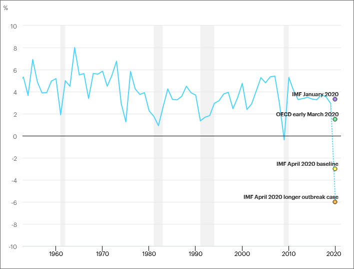
Global annual change in real gross domestic product (GDP), 1960-2020, taken from IEA, Global annual change in real gross domestic product (GDP), 1900-2020, IEA, Paris Image: Global annual change in real gross domestic product.
This decline in economic activity has certainly caused a decline in carbon dioxide emissions; we can calculate, too, the reduction in energy consumption caused by this economic slowdown. In a sense, in 2020-2021 economic activity declined in a way of which any Green ideologist would approve. Millions of people gave up driving and travelling because they were banned from doing this.
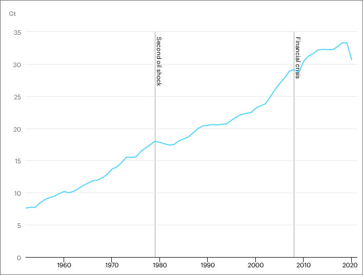
Global energy-related CO2 emissions, 1960-2020, taken from IEA, Global energy-related CO2 emissions, 1900-2020, IEA, Paris Image: Global energy-related CO2 emissions, 1900-2020.
How has this decline affected carbon dioxide emissions and, more to the point, the concentration of carbon dioxide in the atmosphere? Here is the graph of global carbon dioxide concentrations calculated by the NOAA in the USA.
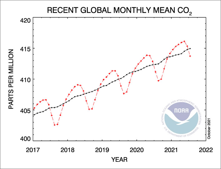
5 Year Global Monthly Mean CO2. Image: National Oceanic and Atmospheric Administration (NOAA) – Earth System Research Laboratory (ESRL).
When we look at this graph, the answer is obvious: not at all. No trace of a change in the rate of increase of carbon dioxide is visible.
We can call this a 'black-box' experiment: we don't need to know what happens inside the box, we don't need to know about the emitters and absorbers in the system, the sources and sinks, radiative transfers and all the other yada yada of climate science.
We just know that economic activity (the input into the box) dropped dramatically and the increasing carbon dioxide concentration in the atmosphere (the output from the box) remained completely unaffected. We wouldn't be surprised that if we opened up the black-box we would find that the input cable was not actually connected to the mechanism inside, so dramatic is this non-existent result.
The CAGW proponents have relied on the climbing chart of atmospheric carbon dioxide concentration to fuel their alarmism; they must now accept that the world can slow down appreciably without affecting that climb one bit. And if an economic slowdown of that catastrophic size produces no discernable reduction in carbon dioxide concentrations, just what draconian economic measures will be needed to make a difference?
Summing up
- We have no idea why atmospheric temperatures change in the long term. There is no detectable correlation with the concentration of carbon dioxide in the atmosphere.
- We have no idea how much warming a doubling of carbon dioxide in the atmosphere will cause, but suspect it will be hardly any. This statement is an essential corollary of statement 1: if statement 1 is true then climate sensitivity has to be negligible.
- Changes in anthropogenic emissions of carbon dioxide seem to have no appreciable effect on the concentration of the trace gas in the atmosphere. This is the expected corollary of statements 1 and 2.
These three statements are completely coherent. What is all the fuss about, in other words? Is this the evidential basis on which the luminaries and the mob of COP26 want to shut down civilisation?
0 Comments
Server date and time:
Browser date and time:
Input rules for comments: No HTML, no images. Comments can be nested to a depth of eight. Surround a long quotation with curly braces: {blockquote}. Well-formed URLs will be rendered as links automatically. Do not click on links unless you are confident that they are safe. You have been warned!